Conducting Symptomate usability study

Conducting Symptomate usability study

Conducting Symptomate usability study

Tools which I used for this project

My Role

I was responsible for overseeing the entire usability study, managing the end-to-end process from planning to execution and analysis

Responsibilities

Defining goals

Defining goals

Developing user scenarios

Developing user scenarios

Conducting user tests

Conducting user tests

Analyzing data and findings

Analyzing data and findings

Creating a report

Creating a report

Overview

Overview

Overview

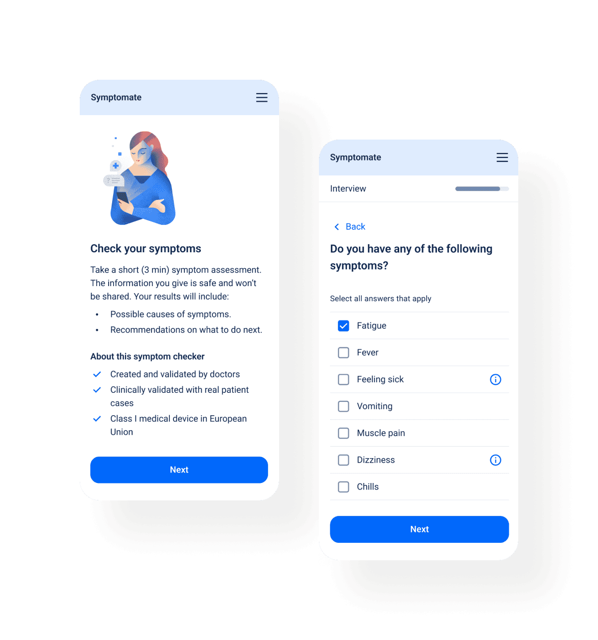
Symptomate is a symptom-checking app created by doctors and powered by AI. The app enables users to input their symptoms and receive analysis of possible medical conditions and relevant health recommendations.

To enhance Symptomate’s user experience and guide the design of Symptomate 3.0, I conducted a comprehensive usability study. The research phase was critical to ensure that upcoming design decisions would be based on concrete user data rather than assumptions.

Goals

Gather insights to provide the empirical foundation needed to guide Symptomate's next development phase.

Goals

Gather insights to provide the empirical foundation needed to guide Symptomate's next development phase.

Goals

Gather insights to provide the empirical foundation needed to guide Symptomate's next development phase.

Identifying the strengths of the current solution

Finding the biggest issues and areas for improvement

Identifying design inconsistencies across the application

Validating the assumption that users found the in-app interview process too long

Identifying the strengths of the current solution

Finding the biggest issues and areas for improvement

Identifying design inconsistencies across the application

Validating the assumption that users found the in-app interview process too long

Identifying the strengths of the current solution

Finding the biggest issues and areas for improvement

Identifying design inconsistencies across the application

Validating the assumption that users found the in-app interview process too long

Methodolgy

Methodolgy

Methodolgy

15 remote, moderated user tests were conducted

Each session included a moderator and an observer

Sessions were recorded using the Lookback app

Tests were performed on mobile and desktop devices

15 remote, moderated user tests were conducted

Each session included a moderator and an observer

Sessions were recorded using the Lookback app

Tests were performed on mobile and desktop devices

15 remote, moderated user tests were conducted

Each session included a moderator and an observer

Sessions were recorded using the Lookback app

Tests were performed on mobile and desktop devices

Session elements

Session elements

Session elements

Pre-test questionnaire

Task scenarios

Post-test questionnaire

Quantitative surveys

Pre-test questionnaire

Task scenarios

Post-test questionnaire

Quantitative surveys

Pre-test questionnaire

Task scenarios

Post-test questionnaire

Quantitative surveys

Results

Assumption validation

The assumption about the interview length was not confirmed. Users appreciated the comprehensive questions for diagnosis, though two suggested more were needed for emergency triage. Follow-up questions were well-received for ensuring no details were missed. 

Key Symptomate strengths

Results and recommendations

10

Users were willing to share results with a doctor and follow recommendations, demonstrating the tool's helpfulness.

Results and recommendations

10

Users were willing to share results with a doctor and follow recommendations, demonstrating the tool's helpfulness.

Results and recommendations

10

Users were willing to share results with a doctor and follow recommendations, demonstrating the tool's helpfulness.

Trust and professionalism

8

Users described Symptomate as useful, professional, and well-made, indicating that it has earned their trust.

Trust and professionalism

8

Users described Symptomate as useful, professional, and well-made, indicating that it has earned their trust.

Trust and professionalism

8

Users described Symptomate as useful, professional, and well-made, indicating that it has earned their trust.

Clear and concise questions

8

Users noted that the questions were specific, precise, and uncomplicated, which contributed to a smooth user experience.

Clear and concise questions

8

Users noted that the questions were specific, precise, and uncomplicated, which contributed to a smooth user experience.

Clear and concise questions

8

Users noted that the questions were specific, precise, and uncomplicated, which contributed to a smooth user experience.

Visual appeal

7

Users praised the application's minimalist design, simplicity, colour scheme, and lack of unnecessary graphics.

Visual appeal

7

Users praised the application's minimalist design, simplicity, colour scheme, and lack of unnecessary graphics.

Visual appeal

7

Users praised the application's minimalist design, simplicity, colour scheme, and lack of unnecessary graphics.

Key Symptomate challenges

Results and recommendations

10

Users generally found them helpful but noted gaps in specialist and care method recommendations. Some were dissatisfied due to being sent to the ER for conditions that could have been managed elsewhere.

Results and recommendations

10

Users generally found them helpful but noted gaps in specialist and care method recommendations. Some were dissatisfied due to being sent to the ER for conditions that could have been managed elsewhere.

Results and recommendations

10

Users generally found them helpful but noted gaps in specialist and care method recommendations. Some were dissatisfied due to being sent to the ER for conditions that could have been managed elsewhere.

Medical terminology

4

Users experienced difficulty with complex medical terms in some answers, particularly different types of abdominal pain and fever types, indicating a need for simpler language.

Missing health context

6

Users noted the absence of key questions about medications, lifestyle, exercise, and symptom duration, limiting the assessment's accuracy.

Missing health context

6

Users noted the absence of key questions about medications, lifestyle, exercise, and symptom duration, limiting the assessment's accuracy.

Missing health context

6

Users noted the absence of key questions about medications, lifestyle, exercise, and symptom duration, limiting the assessment's accuracy.

Regions selection

8

Users tried to select a specific country but ended up highlighting the entire European region, thinking they had made a mistake. This confusion was partly due to the map's design, which displays country outlines, leading five users to believe country-level selection was intended.

Age entry

4

Users preferred entering their age manually rather than using the slider, which they found particularly problematic on mobile devices. They believed manual entry would be faster and more convenient.

Age entry

4

Users preferred entering their age manually rather than using the slider, which they found particularly problematic on mobile devices. They believed manual entry would be faster and more convenient.

Age entry

4

Users preferred entering their age manually rather than using the slider, which they found particularly problematic on mobile devices. They believed manual entry would be faster and more convenient.

Medical terminology

4

Users experienced difficulty with complex medical terms in some answers, particularly different types of abdominal pain and fever types, indicating a need for simpler language.

Medical terminology

4

Users experienced difficulty with complex medical terms in some answers, particularly different types of abdominal pain and fever types, indicating a need for simpler language.

Medical terminology

4

Users experienced difficulty with complex medical terms in some answers, particularly different types of abdominal pain and fever types, indicating a need for simpler language.

Symptoms selection

4

Users encountered difficulties with mobile interactions, specifically struggling to find the body model and experiencing a cumbersome symptom selection process where the search dropdown automatically closed after each selection, forcing users to reopen it repeatedly.

Symptoms selection

4

Users encountered difficulties with mobile interactions, specifically struggling to find the body model and experiencing a cumbersome symptom selection process where the search dropdown automatically closed after each selection, forcing users to reopen it repeatedly.

Symptoms selection

4

Users encountered difficulties with mobile interactions, specifically struggling to find the body model and experiencing a cumbersome symptom selection process where the search dropdown automatically closed after each selection, forcing users to reopen it repeatedly.

Missing health context

6

Users noted the absence of key questions about medications, lifestyle, exercise, and symptom duration, limiting the assessment's accuracy.

Symptoms selection

4

Users encountered difficulties with mobile interactions, specifically struggling to find the body model and experiencing a cumbersome symptom selection process where the search dropdown automatically closed after each selection, forcing users to reopen it repeatedly.

User-driven improvements

User-driven improvements

User-driven improvements

Following our usability tests, we developed a clear roadmap to prioritize and address key user pain points, enabling us to implement the most critical improvements efficiently. We have already enhanced region selection, simplified age entry, and strengthened our recommendations to offer clearer guidance.

Moving forward, we will introduce plain-language updates, redesign symptom selection on mobile devices to improve intuitiveness, and implement accessibility enhancements to ensure a more user-friendly and inclusive experience.
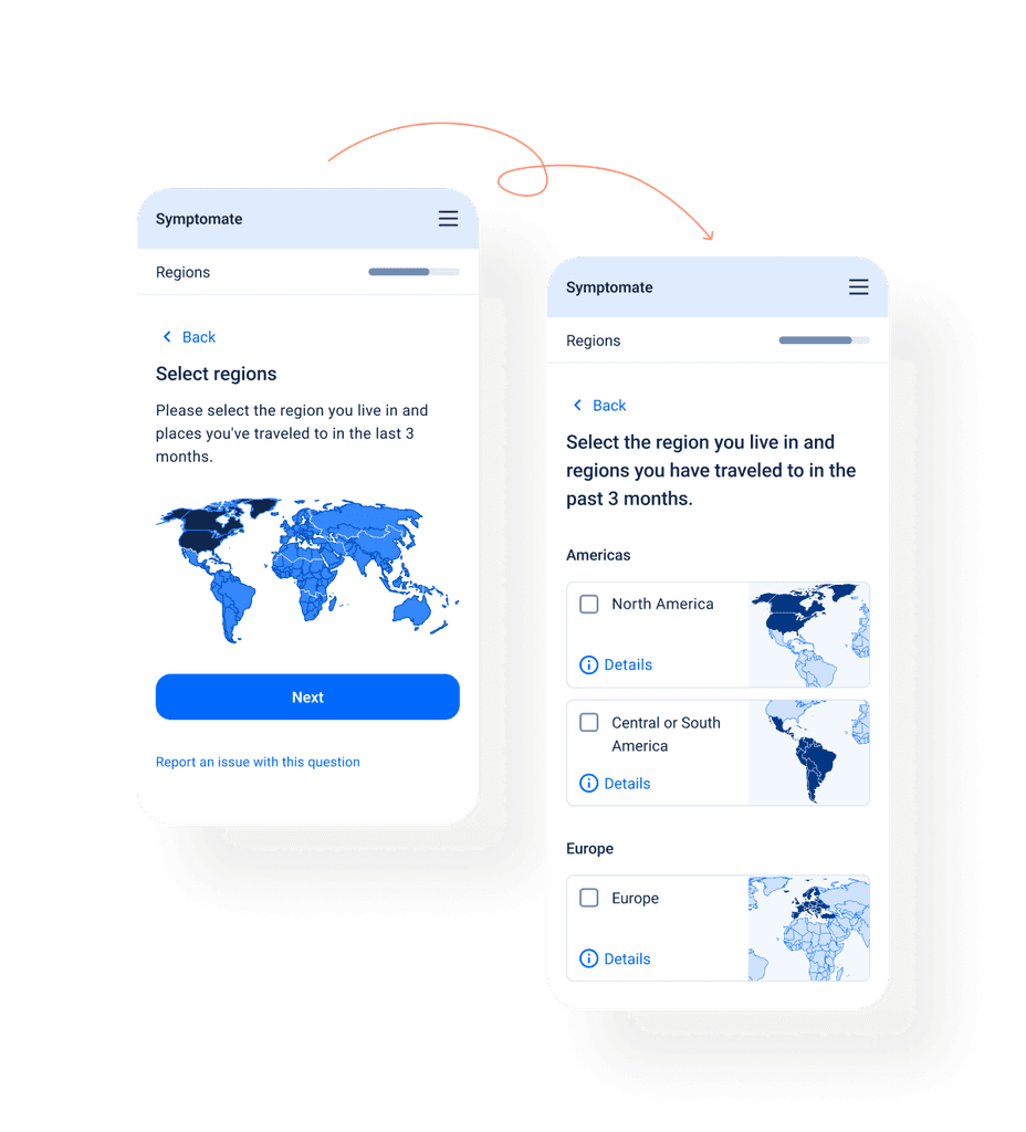
Regions selection

I redesigned the regions selection feature to clarify that users can select multiple regions and must choose entire regions, not countries. A/B tests confirmed that the new design improved user understanding and interaction, enhancing usability.
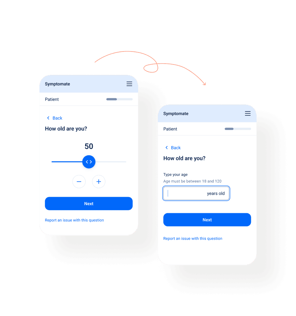
Age entry

We simplified the age entry process by replacing the age slider with a straightforward input field. This change reduced errors and users now spend less time on this screen.
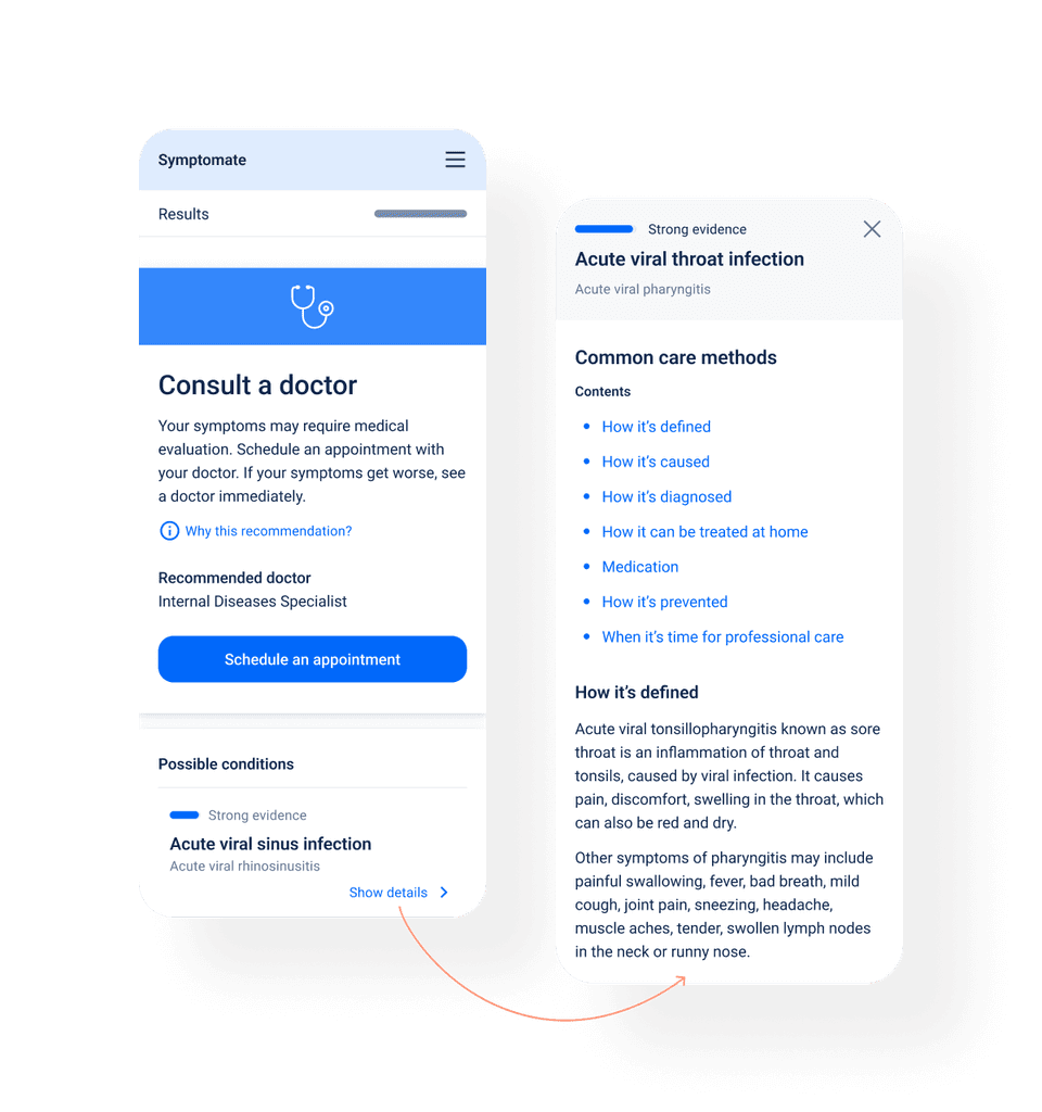
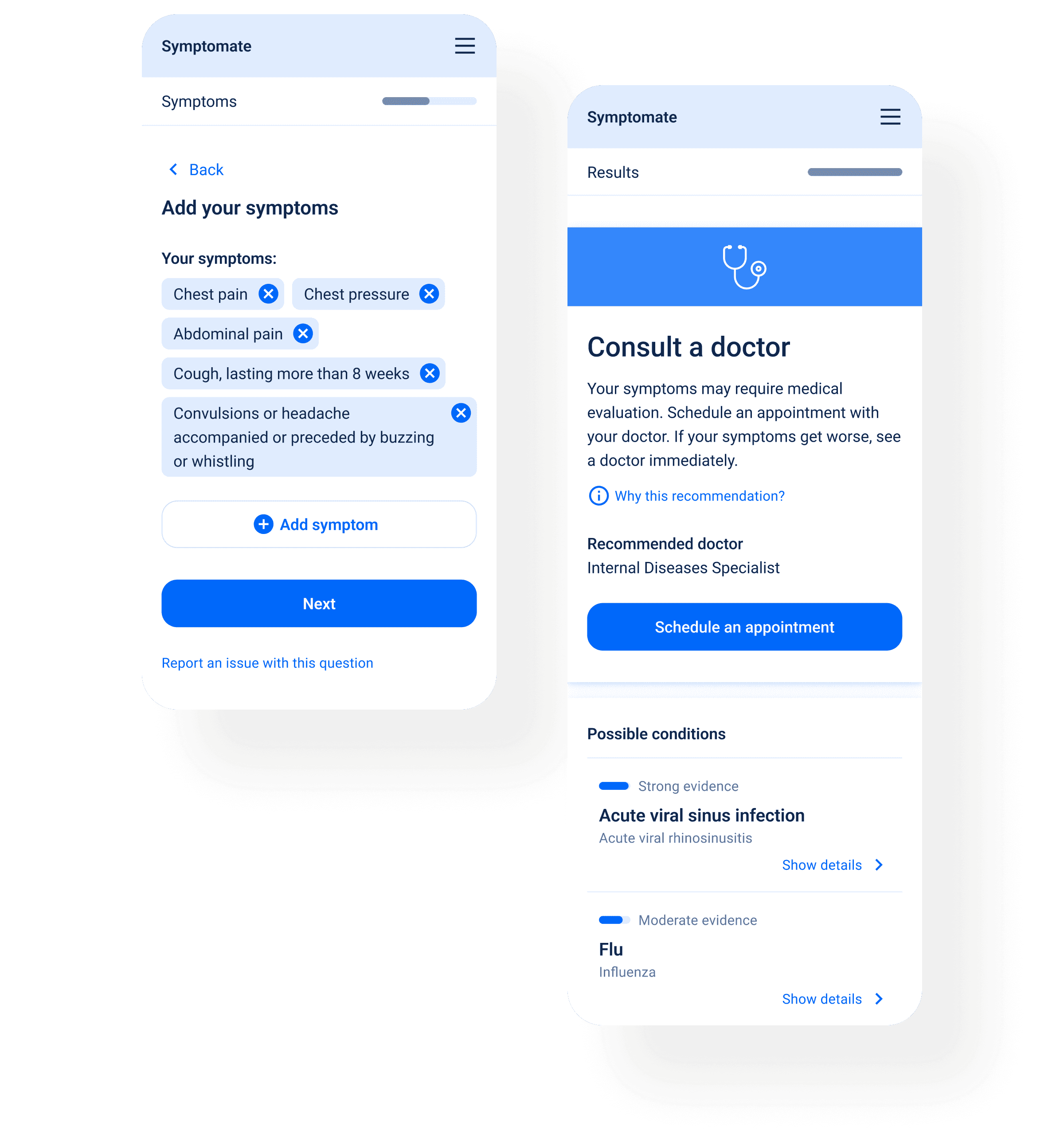
Recommendations

We enhanced our recommendations by introducing a specialist and channel recommender for "Consult a Doctor" triages, helping users choose the right doctor and consultation method. Additionally, we added a patient education feature with self-care methods for possible conditions, which we regularly update to cover a broader range of conditions.

Next project

Next

Next project

Say hi!

jedrzejas.alicja@gmail.com

+48 501 448 730

LinkedIn

Say hi!

jedrzejas.alicja@gmail.com

+48 501 448 730

LinkedIn

Say hi!

jedrzejas.alicja@gmail.com

+48 501 448 730

LinkedIn